EXPERIENCE CREATED
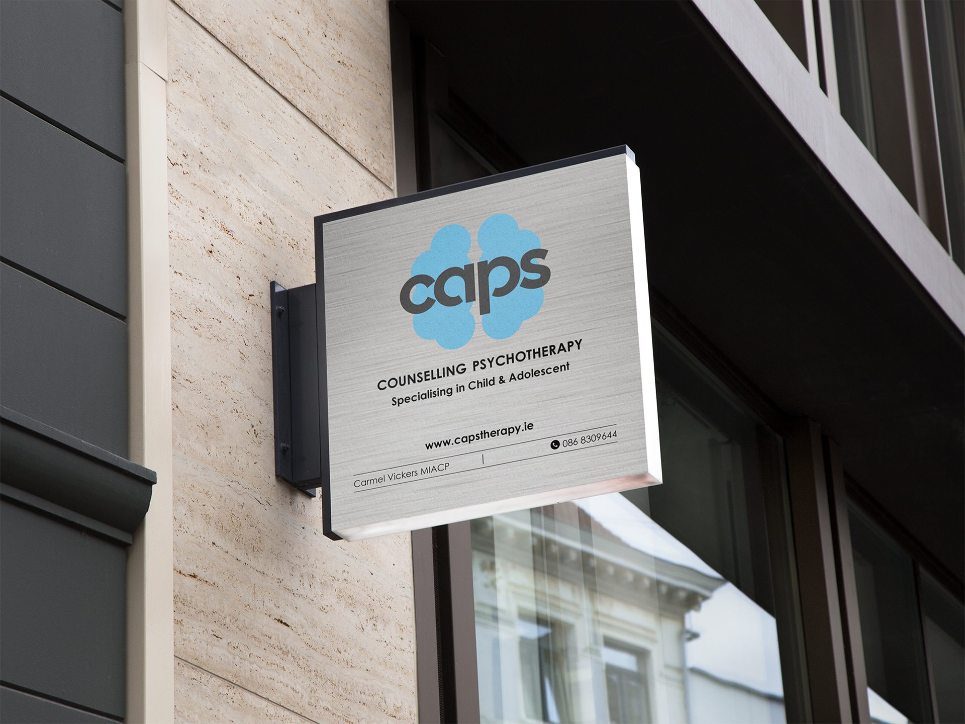
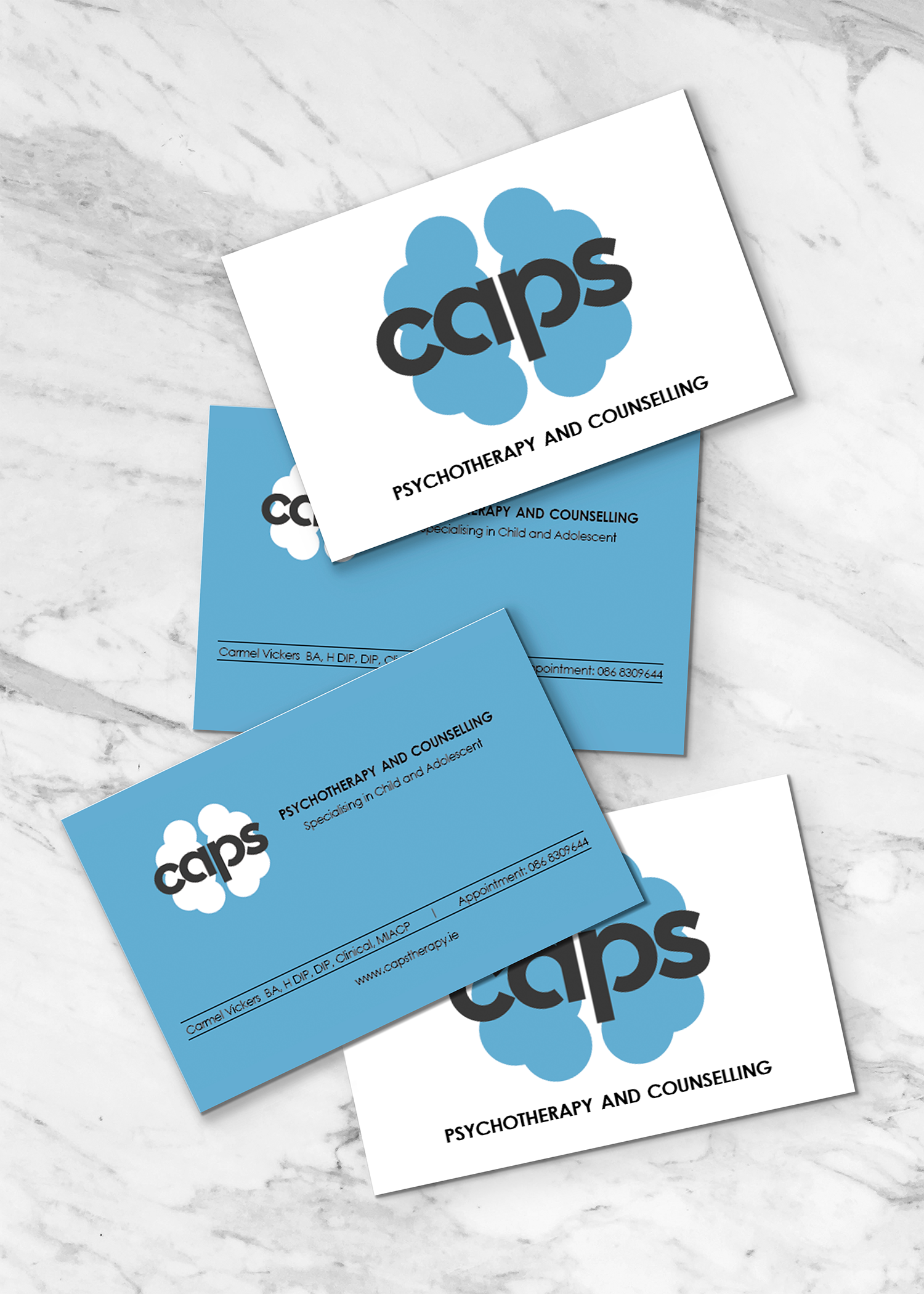
BRAND / LOGO / BUSINESS CARD / SIGNAGE
CAPS Psychotherapy
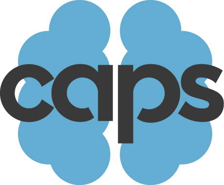
CAPS Psychotherapy practice in Dublin, Ireland reached out to Mckenzieking Designs for help with branding which would include design of a logo, business card, and signage. CAPS offers a range of therapeutic services including children's therapy. The client wanted the idea of a brain within the logo but wanted it to appeal to both young and old with colours that had an empathetic, calming and relaxed feel.
When we are faced with the important task of serving those who are suffering with emotional and mental distress, it is vital we consider the way colour will affect them. It is important that the colours guide them towards having hope in your solutions not drive them away. Light blue was chosen as it is a well-liked colour for all ages, genders, and cultures. Blue is often seen as a most trustworthy, reliable, and responsible colour and often used for building trust and instilling peace.
The logo is intuitive of a silhouette of the brain, while also resembling the symmetrical image of a Rorschach ink blot test used by psychotherapists for helping them understand how people respond emotionally. We used circles to create the silhouette because circles represent care giving and positive flowing energy.
A curved sans serif font was used to convey neutrality, and using a softer curved font represents connection and community, harmony and protection, in this case working to empathize with the patient and it is also a fun font with personality which helps capture the attention of adolescents helping them identify with the practitioner.