
Changing Lives Through Microlending
Summary & Client Brief
According to data released by the World Bank, more than 1.7 billion people around the world are unbanked and can’t access the financial services they need. SaveForward’s mission is to motivate people to create opportunity for individuals living in underbanked regions of the world. SaveForward is doing this by crowdfunding life-changing loans.
The SaveForward crowdsourcing platform allows socially-conscious millennials to provide funds to borrowers in developing countries who are unable to access traditional banking services. SaveForward works with Microfinance institutions (MFIs) to connect and distribute loans to borrowers that MFIs are not able to fund.
The Challenge
SaveForward had an existing web app with low usage, prompting the development of a mobile app targeting socially conscious millennials and others interested in making a difference. The goal was to inspire app usage without focusing on traditional savings concepts, emphasizing that individuals don't need to be wealthy to contribute positively.
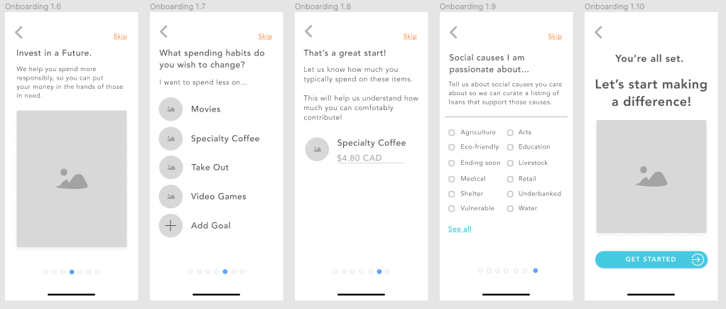
Given that SaveForward aimed to engage socially conscious millennials, a mobile-first approach was crucial. The interface was designed with touch-friendly interactions, large tap targets, and a streamlined loan process that minimized friction. Progressive disclosure techniques ensured users weren’t overwhelmed with financial details, keeping the experience intuitive and stress-free.
However, I recognized that the core concept of SaveForward as a savings or lending platform presented a significant challenge. Users weren't truly saving, as the value of their money decreased over the loan period, and they weren't receiving interest as in a traditional loan. This inherent disconnect between user expectations and the actual financial reality of the platform threatened to hinder user engagement and adoption.
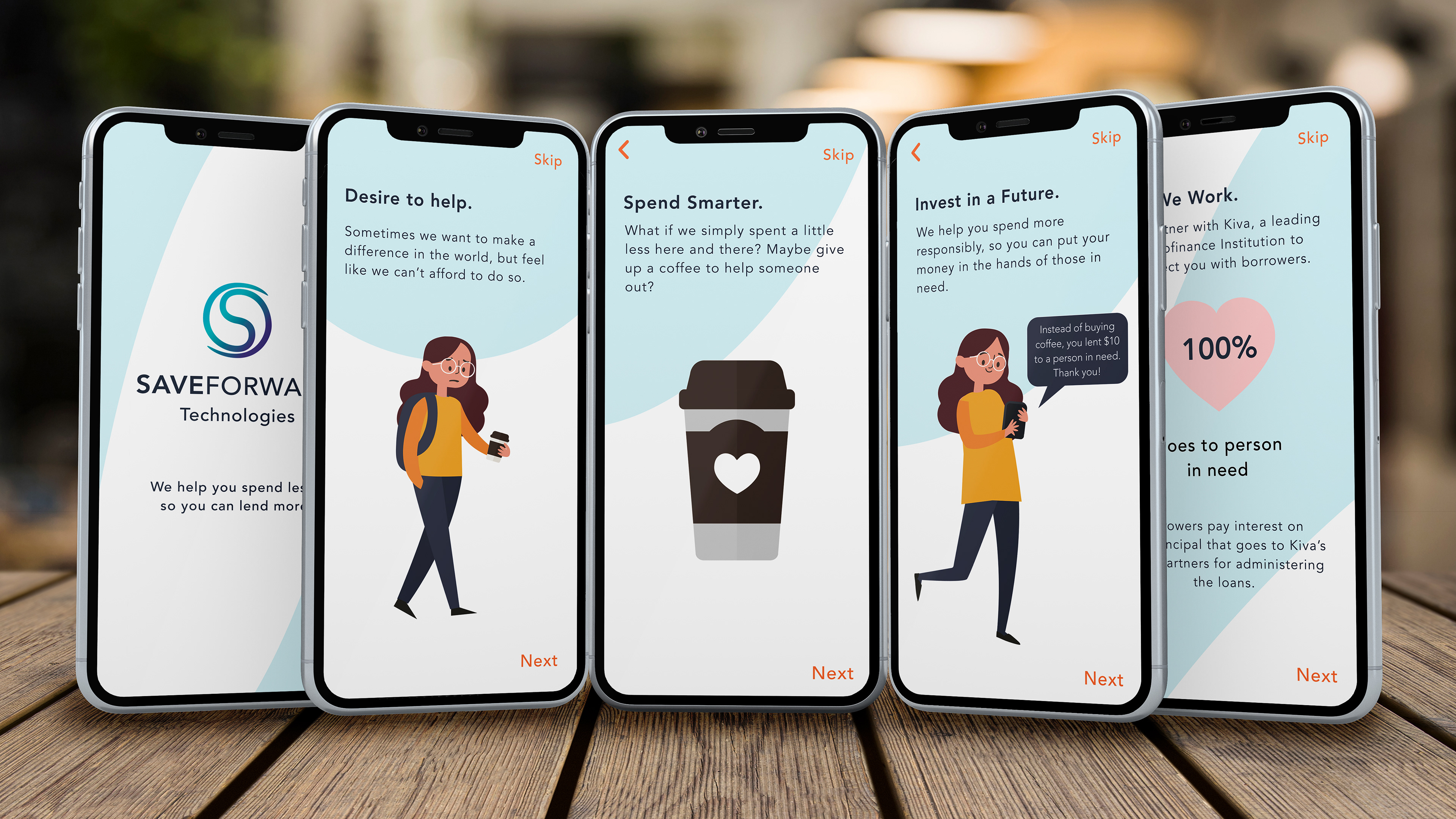
Recognizing this, I pivoted the project's direction to ensure viability. I shifted the focus from "saving" to "spending less," encouraging users to adopt more responsible spending habits to free up funds for small loans.
The Research Process
My research combined surveys and competitive analysis. Survey results indicated that the app should emphasize validating users' social impact through lending while reassuring them that their own finances would remain secure. A competitive analysis of microfinance institutions and crowdfunding platforms revealed that transparency of funds and flexible payment options were crucial features.
To gain a deeper understanding of user motivations and needs, I led the research efforts, employing a mixed-methods approach. This included a user survey with 150 participants, focusing on their spending habits, philanthropic tendencies, and motivations for charitable giving. Additionally, I performed a competitive analysis of five leading microfinance platforms and three crowdfunding websites, examining their user interfaces, features, and user engagement strategies. This research revealed a strong correlation between emotional connection to a cause and the likelihood of lending. This key insight directly informed my decision to prioritize borrower success stories as a prominent feature, prominently displaying them on the dashboard and lending screens to foster empathy and engagement.
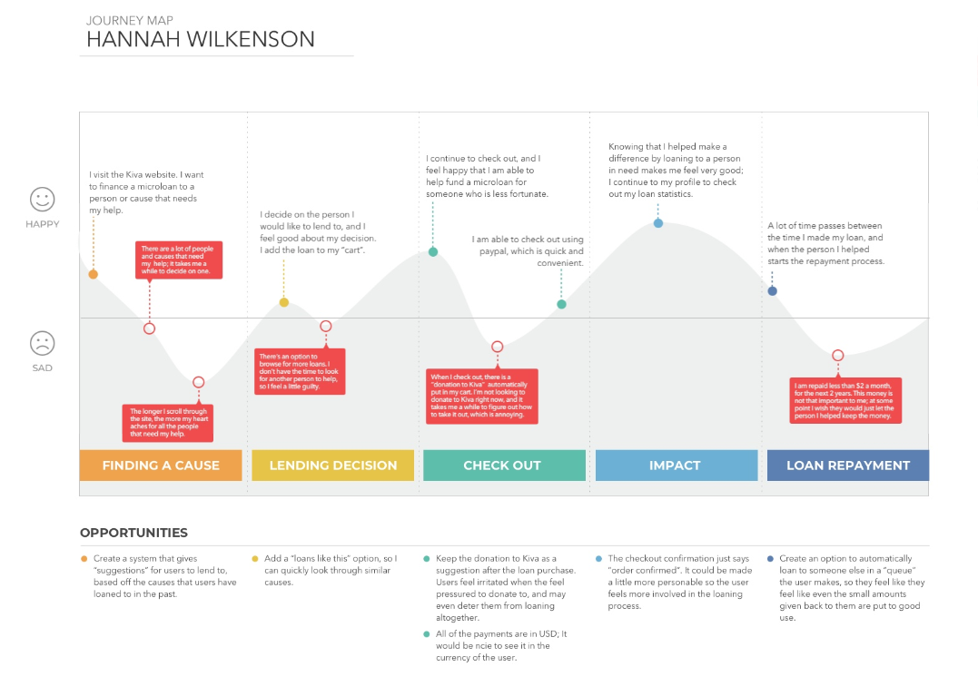
Using these insights, I developed affinity diagrams and user stories to define key user personas. From there, I created a user journey map focused on our primary persona: the frugal student.
Journey Map
The Solution
I determined that if the app retained a savings element, it should focus on saving for smaller, "instant gratification" items, with an emphasis on rewards and encouragement. The core idea became: whenever a user considers a small purchase or impulse buy, they would instead have the option to make a microloan to someone in need.
This approach addresses the concern of compromising personal finances. Users gain the satisfaction of foregoing a small pleasure to contribute to something meaningful for others. This empowers them to lend consistently without needing constant financial monitoring.
The primary challenge was creating a platform that seamlessly connected willing lenders with deserving recipients. User motivations for microloans are driven by the stories of those they help and the desire to make a social impact, aligning with their often emotionally driven spending habits. I designed a system within the app to facilitate this with a single tap, ensuring users never feel pressured to overextend their finances.
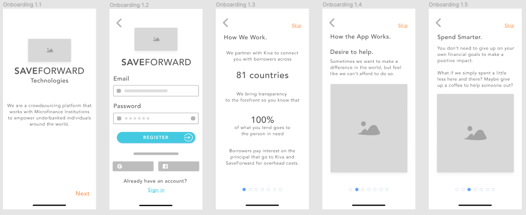
The onboarding wireframes (shown below) clearly and concisely guide users through the app's purpose, sign-in process, and functionality, demonstrating how they can spend smarter and invest in someone's future simultaneously.
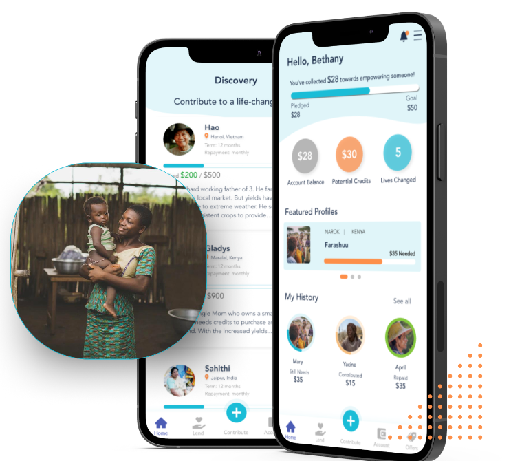
The Dashboard
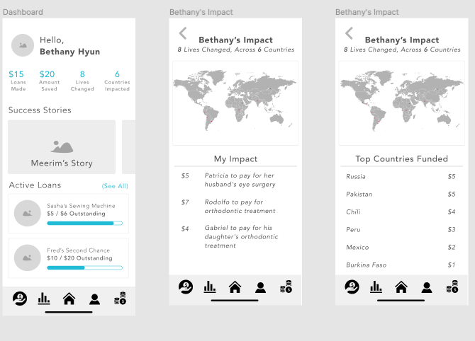
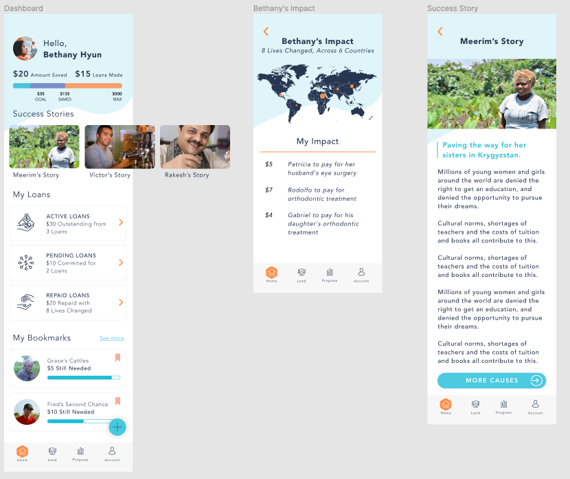
After onboarding, the dashboard provides users with a clear snapshot of their lending impact. At a glance, they can see the total amount they've loaned, how much they've saved by making those loans, the number of people they've helped, and the global reach of their contributions. The dashboard also features inspiring borrower success stories and allows users to easily manage their active loans.
To create a seamless and engaging user experience, I integrated meaningful microinteractions throughout the app. When users made a loan, a subtle animation reinforced their contribution, providing immediate positive feedback. Real-time visual updates on the dashboard displayed the impact of their lending, ensuring transparency and user trust.
Additionally, I designed an interactive world map that would light up in areas where users had made contributions. This feature gave users a visual sense of their global impact, making their lending journey more tangible and emotionally rewarding. Smooth transitions, animated loading states, and progressive form validation further streamlined navigation, reducing friction and improving task completion rates.
Below is a look at the final Design and Solution for the SAVEFORWARD app.
Solution - Creating Intentionally Emotion-Driven Designs.
My design strategy centered on creating an emotionally resonant experience that connects users to the impact of their lending. This was particularly crucial for personas like Bethany, who are motivated to help others but may feel financially constrained.
Onboarding and Core Functionality:
The onboarding process focuses on making the app's functionality relatable and clear, emphasizing the connection between spending less and lending more. This core concept is reinforced on the main dashboard, which provides a summary of savings, loans made, and lives changed.
Key Features and Emotional Drivers:
Success Stories: A swipeable gallery of borrower success stories provides a tangible sense of accomplishment, showing users they are part of a community empowering individuals in developing nations. This reinforces the positive impact of their loans.
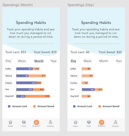
My Loans: This section allows users to easily track the status of all their active loans.Progress Tracking: A clear visual representation shows the relationship between savings and lending, using relatable examples like the "coffee example" (saving $14, lending $11, with an opportunity to lend more).
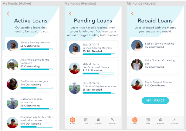
My Account (Funds): This section displays repaid loan amounts ("Deposits") that can be transferred to the user's bank account. Funds are categorized as active, pending, and repaid for easy management.
My Account (Funds): This section displays repaid loan amounts ("Deposits") that can be transferred to the user's bank account. Funds are categorized as active, pending, and repaid for easy management.
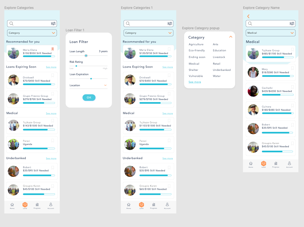
Personalized Settings: Users can customize their spending and lending categories after onboarding. Spending settings allow users to track existing or new spending goals. Lending settings allow users to select preferred loan categories, influencing loan recommendations. This personalization ensures the app remains relevant to each user's interests and strengthens their emotional connection to the lending process.
Making the first loans ‘recommended’ loans, catered towards the user's loan interests. For people like our personas, Bethany and Hannah who want to feel an emotional connection with the people they lend to, this is a good way to keep them engaged and involved.
When the user makes a loan, the lending screen is formatted in the currency of items they want to spend less on, in this case, instead of buying a coffee, the user will lend to a cause.
Along with the credit card option, we also have the option of lending the money from our save forward deposits, which is money we’ve previously lent out and has been repaid.
The confirmation check out further enforces the warm feeling of helping others, while cutting down on unnecessary spending. It also shows the transparency of risk by showing that 96.7% of borrowers have been able to repay their loans.
Conclusion/Results
Following user testing of the prototype, we saw a 20% increase in user engagement with the lending feature, demonstrating the effectiveness of the emotionally driven design approach that I championed throughout the project. This validated the initial pivot and highlighted the power of connecting users to the impact of their lending.
SaveForward needed to create a frictionless, self-service experience that empowered users to manage their funds with confidence. By designing an intuitive lending journey, simplifying financial decision-making, and integrating real-time feedback, I ensured that users could navigate micro-lending seamlessly.
My Role
My role in the SaveForward project was as the lead UX/UI designer, responsible for defining and delivering a user-centered and emotionally resonant experience. From the outset, I recognized a critical disconnect between the initial project concept and user expectations, leading me to advocate for a strategic pivot towards a spending-less/micro-lending model. I then led the user research efforts, employing a mixed-methods approach to gain a deep understanding of user motivations and needs, particularly focusing on the emotional drivers behind charitable giving and micro-lending. These insights directly informed key design decisions, such as the prioritization of borrower success stories and the personalized lending experience. Throughout the project, my focus was on creating a platform that not only facilitated micro-lending but also empowered users to feel a genuine connection to the positive impact of their contributions.
I was also mindful of data privacy and security, adhering to PIPEDA compliance requirements.
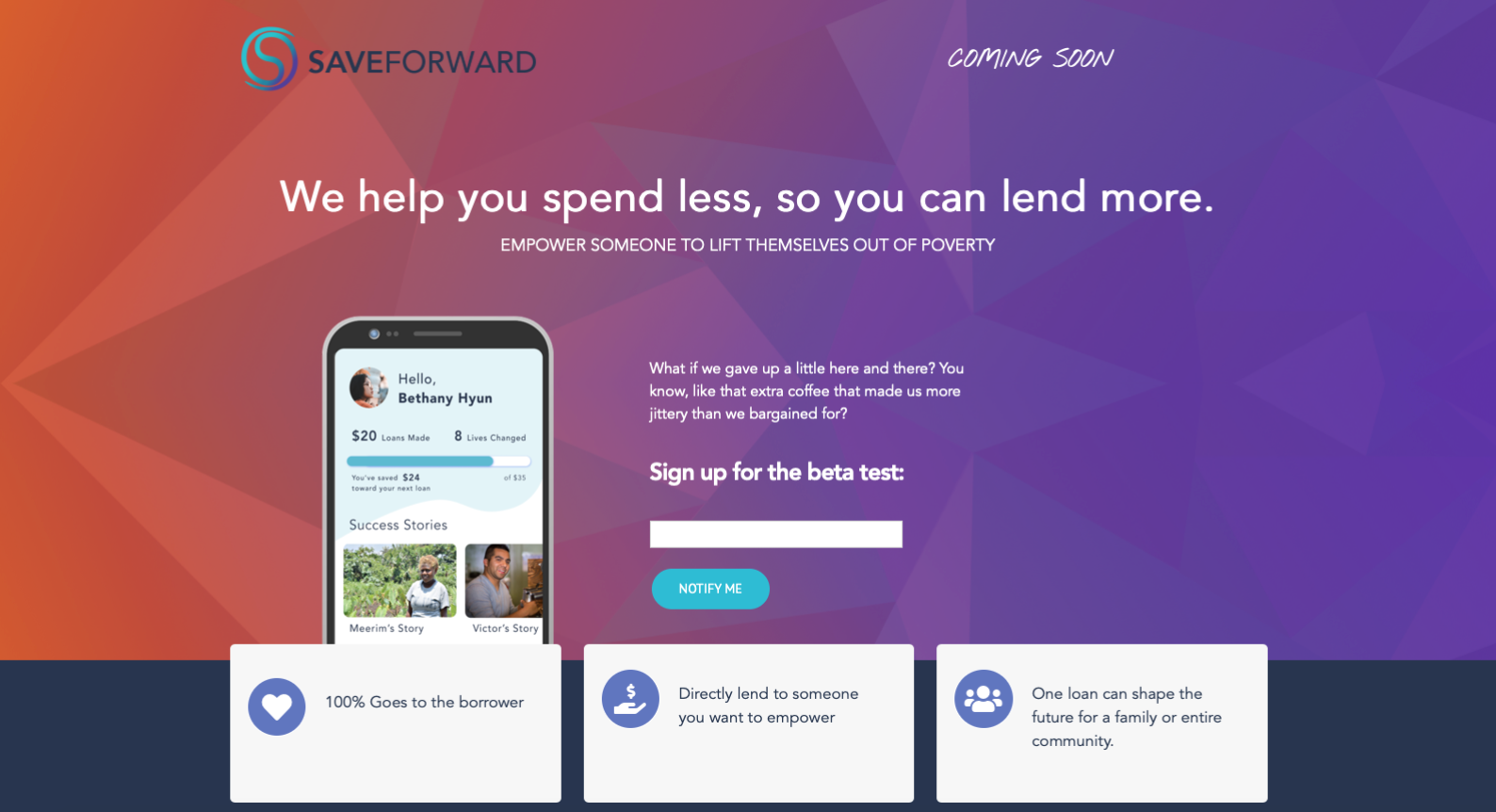
SaveForward is currently in the process of developing this app so please watch for the mobile app coming soon.
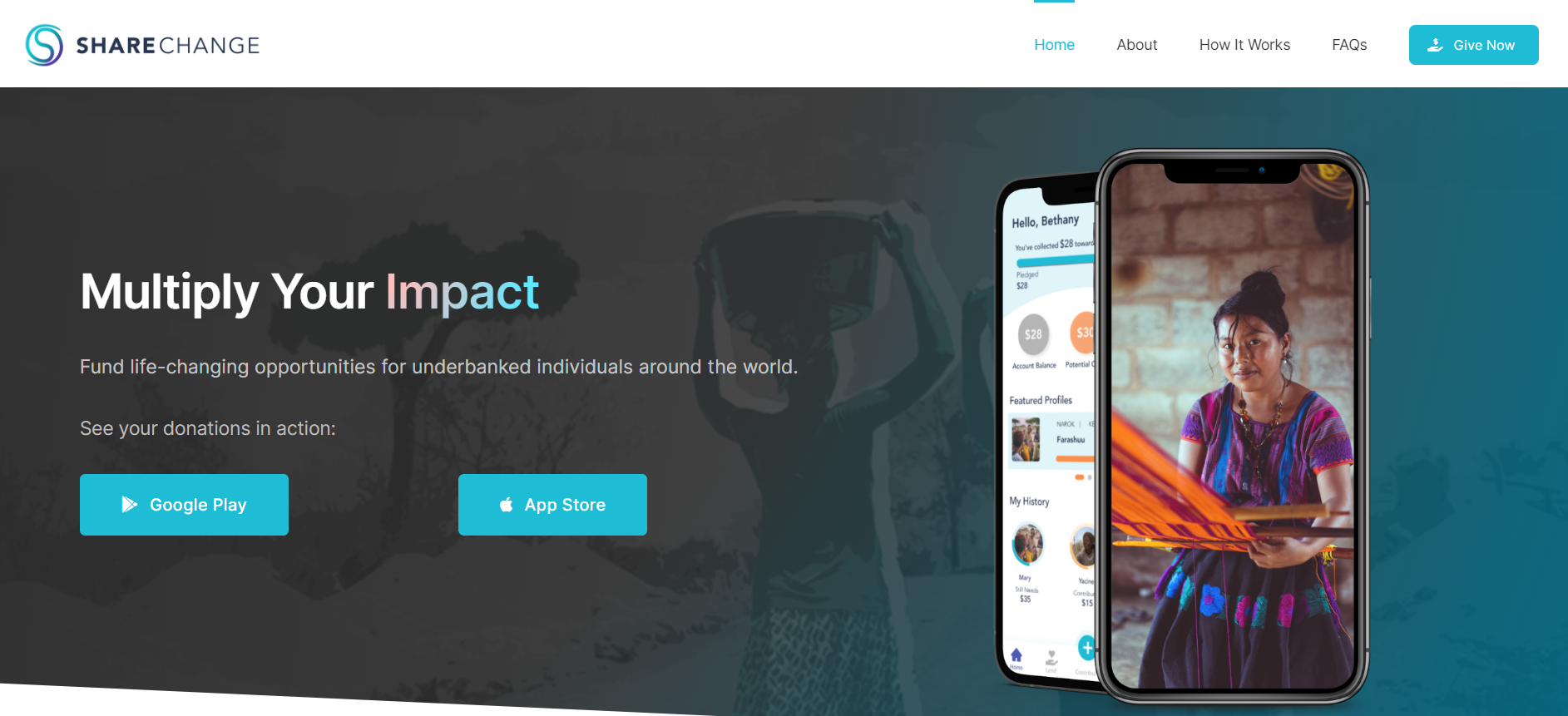
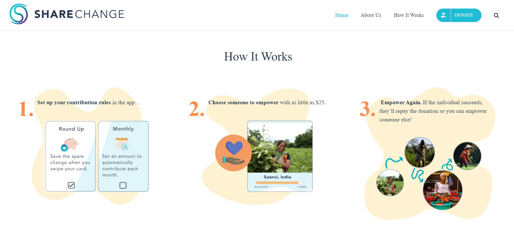
An update on this project 2022
SaveForward changed their company name to ShareChange and are currently partnered with Penda Capital in Uganda. To learn more or to make a donation click the link for the ShareChange website. The mobile app can be found on Google Play and iOS.
TESTIMONIAL
Diane is a highly skilled and professional designer. She helped work on the SaveForward app design, from start to finish, contributing to user research, copy, UX, and more. We were beyond impressed with the prototype and additional business recommendations we received. I would definitely recommend Diane for any web, mobile app, or UX design projects. She is a pleasure to work with.
Celyn Brown
Co-Founder & CEO SaveForward
Co-Founder & CEO SaveForward
Want to work with us?