Visualizing Social Media Insights: A Dashboard Approach
This was a design challenge presented to us as below.
UX Design Track
Design a dashboard for helping people to make everyday decisions. It could be either B2C or B2B. We had the choice of a target audience of our interest. This was a 5-day project.
Requirement
Analysis of a business opportunity
A user journey map
A wireframe showing the interaction flow between pages.
Primary Objective
Primary Objective
We decided on a social media dashboard for the challenge with the primary objective being to build a social media campaign dashboard for a publishing and marketing company so that the persona would have the ability to easily create marketing campaigns and posts as well as see how well posts and campaigns are performing. Also, the user would have the ability to find out what the competition is up to. Added features include brand keywords and VIP lists and sharing with team.
Business Opportunity
Over the past decade social media has become very important to generating leads and growing your business. You spend a great deal of time engaging, sharing, and interacting. With the amount of information available, and the amount of people sharing content, it’s easy float off into the chasm of social media.
That’s why social media dashboards have become so significant. They are the ideal approach to monitor your different social media accounts and keep track of mentions, hashtags, and notifications. A social media dashboard offers you a way to get the information that’s important to you quickly and easily, without additional diversions.
Persona
The Primary Persona is the owner of a publishing and marketing company. We based this project around a publishing company based of the clients of the company that presented us the design challenge.
The user persona is a small publishing marketing company run by a woman who is working on her client projects as well as her own company's social media marketing. She needs to be able to see all the social media channels at once and see how campaigns are performing and be able to schedule posts easily to different platforms and also see her analytics all easily under one umbrella so that her time can be used effectively.
Competitive and Comparative Analysis
There are many competitors out there offering different features, pricing, etc. for a social media dashboard. We looked at two in particular.
Competitors:
Planoly and Hopper HQ
Goals:
Discover industry trends.
Understand how competitors approach and solve problems.
Identify opportunities for Viraly to stand out.
The diagram below shows a quick summary but to add to this, some features that Planoly has that would be nice to incorporate into Virally at some point are Planoly's Sellit and Stories Edit. We also liked Hopper HQ's image editing feature.
However, for our purposes with our primary persona, we have added features that we believe are mostly needed for Dana's quick decision making on her posts and campaigns.
However, for our purposes with our primary persona, we have added features that we believe are mostly needed for Dana's quick decision making on her posts and campaigns.
Features that help to track campaigns, track keywords and hashtags, track competitors, track mentions, monitor analytics, include team members, and easily respond and engage.
The image below shows how Virally has the opportunity to stand out from its competitors from researching hashtags to the ability to connect to third-party tools and much more.
The image below shows how Virally has the opportunity to stand out from its competitors from researching hashtags to the ability to connect to third-party tools and much more.
Feature List (Product requirements)
Homepage:
• Logo
• Top Nav
• Help
• Account
• Log out
• Left Nav
• Dashboard
• Publish
• Calendar
• Campaigns
• Share Buttons
• Approve
• Reports
• Social CRM
• Logo
• Top Nav
• Help
• Account
• Log out
• Left Nav
• Dashboard
• Publish
• Calendar
• Campaigns
• Share Buttons
• Approve
• Reports
• Social CRM
Dashboard:
• Get Started
• Latest Activity
• Looking for Something Else
• Explore More Features
• Get Started
• Latest Activity
• Looking for Something Else
• Explore More Features
Publish:
• Top Nav
• Publish
• Queue
• Sent
• Draft
• Schedule
• Import
• RSS
• Top Nav
• Publish
• Queue
• Sent
• Draft
• Schedule
• Import
• RSS
Journey Map
The Journey Map was set up to show the different stages of the user persona journey before, during, and after using the social media dashboard. It shows the actions and motivations, problems and opportunities for each stage.
Style Guide
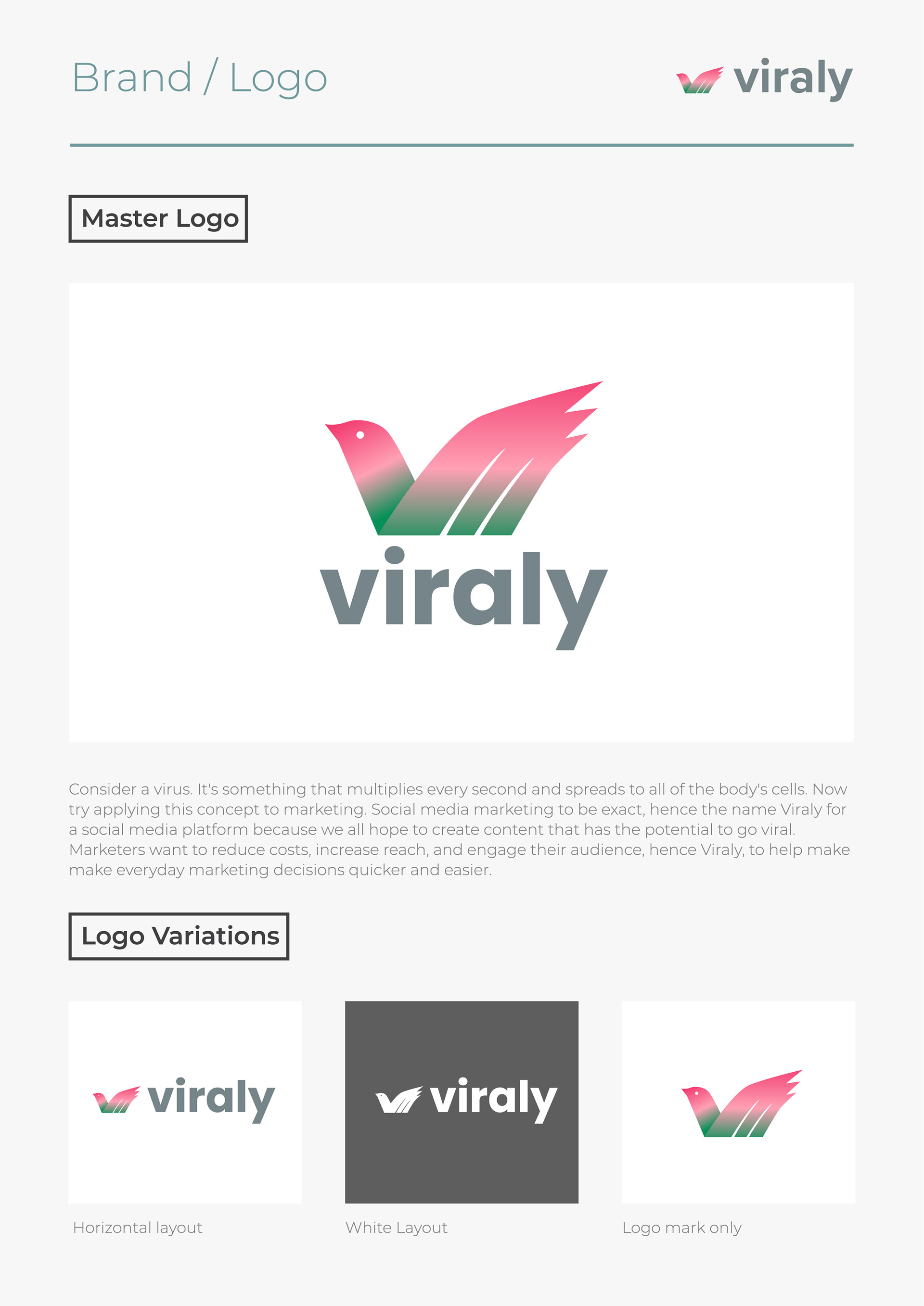
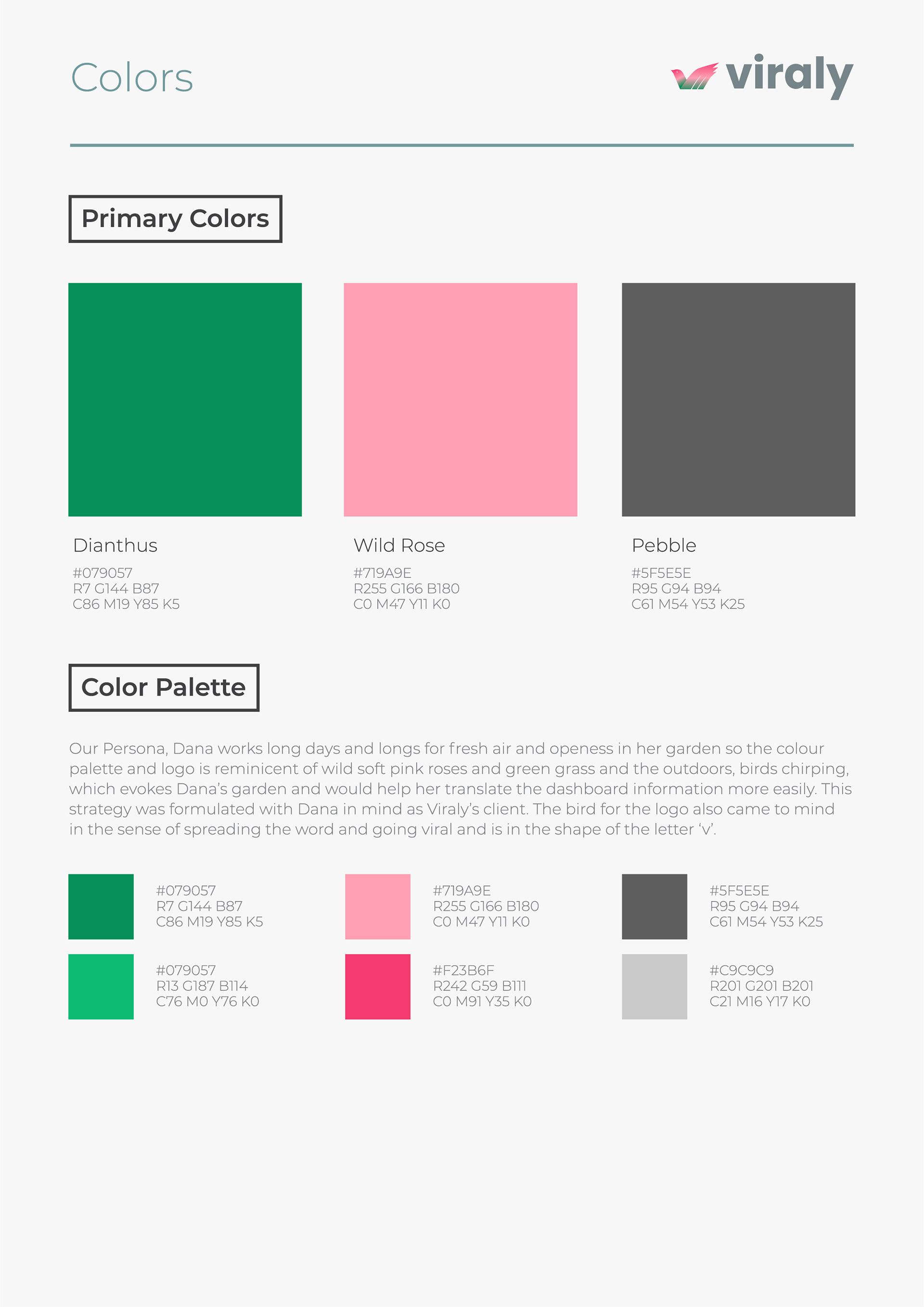
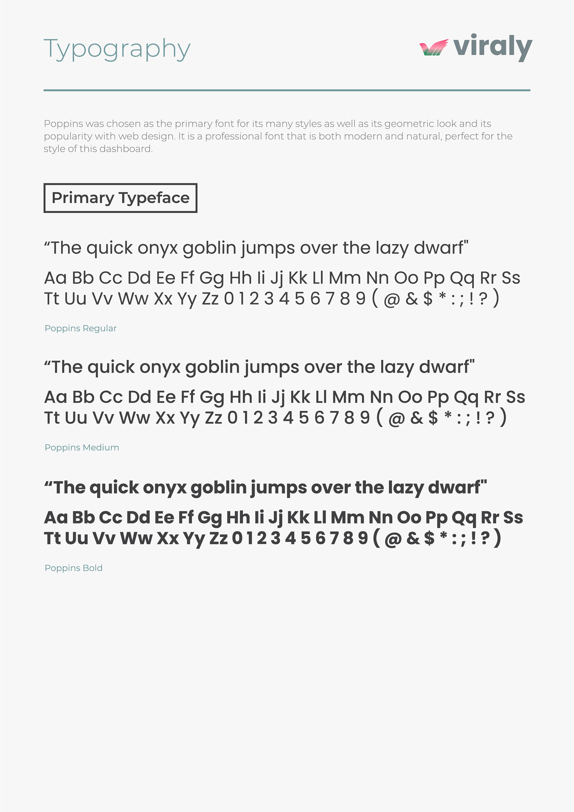
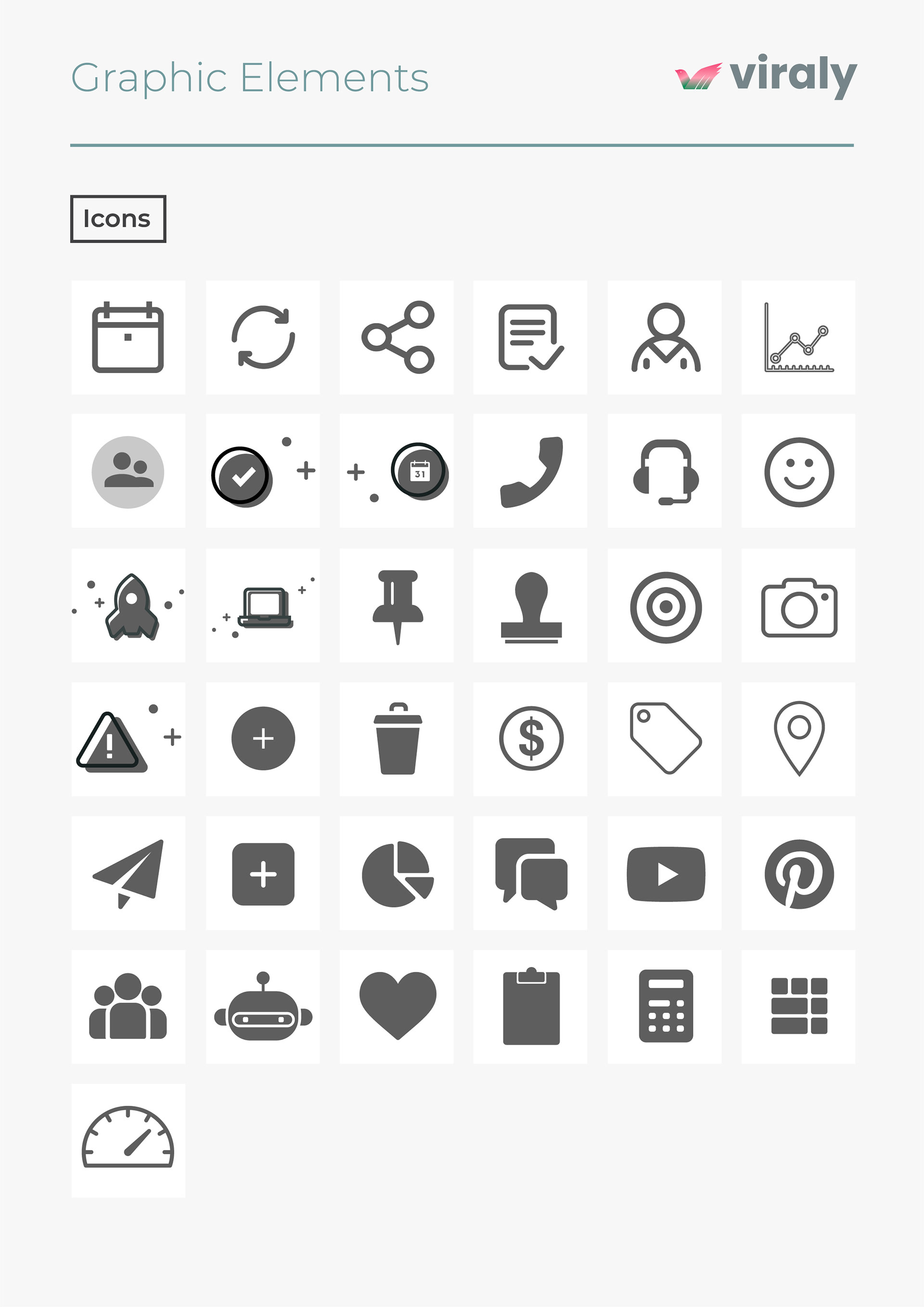
The Style Guide below shows the idea for the logo and the variations for logo use. It shows the primary colors chosen for the design as well as the font used and the icons that were created as graphic elements.

UX Wireframes
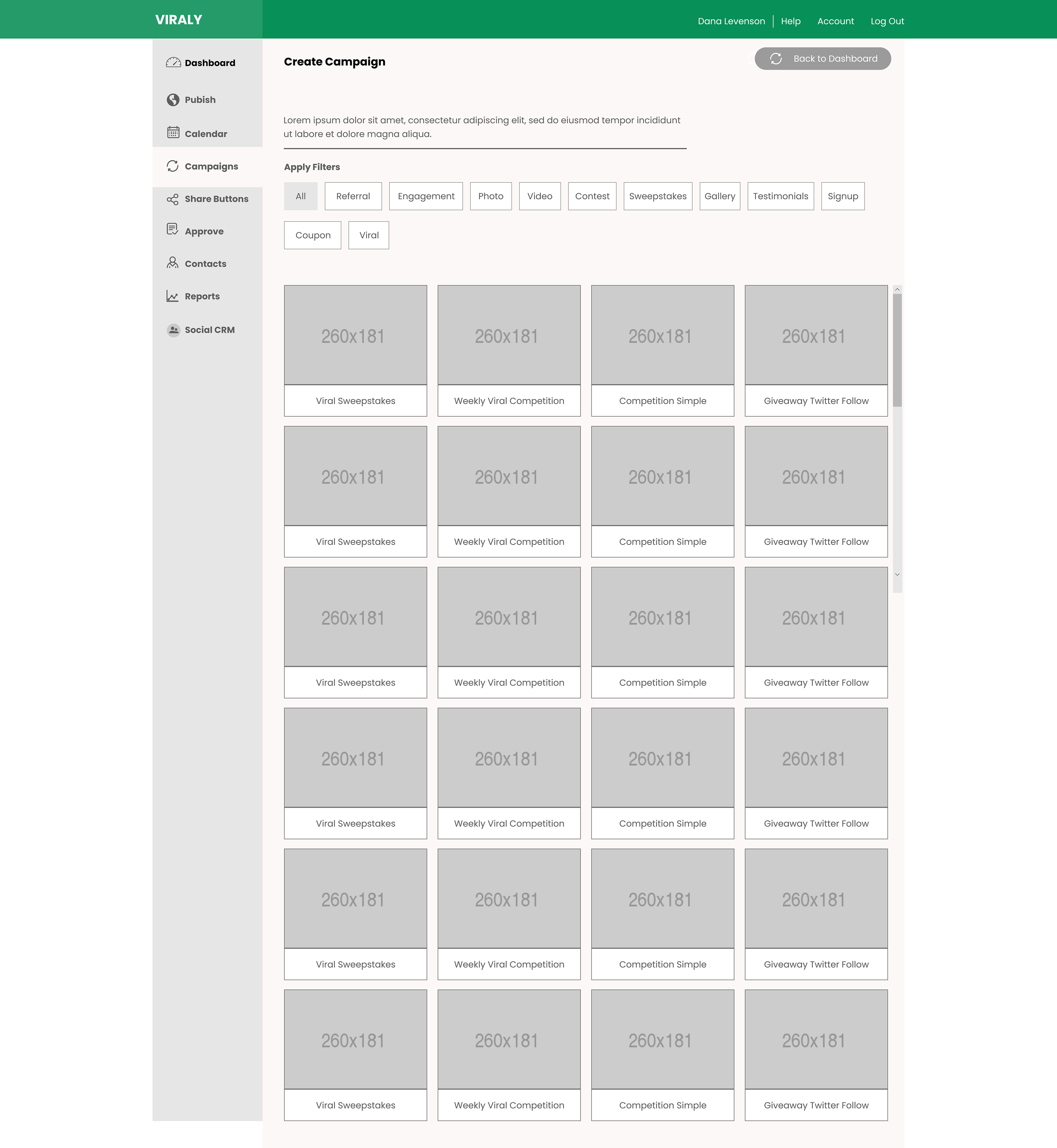
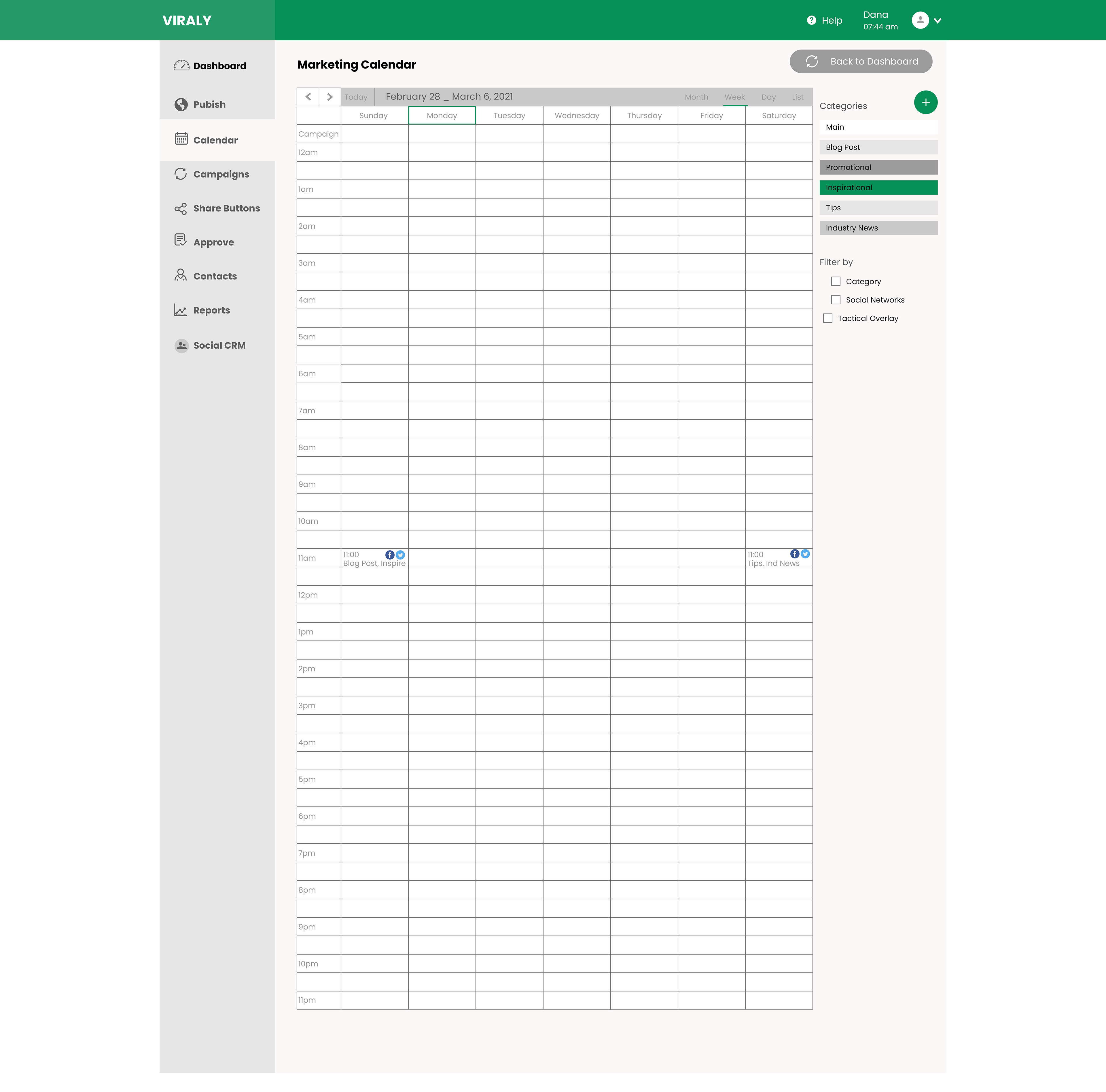
Below are some of the wireframes that were designed around the persona to help with the user goals and frustrations. Essentially, once logged in, the first thing the user comes to is the dashboard and from here the user is able to do everything needed from composing a message to viewing the engagement report, connecting more profiles, or seeing performance activity.
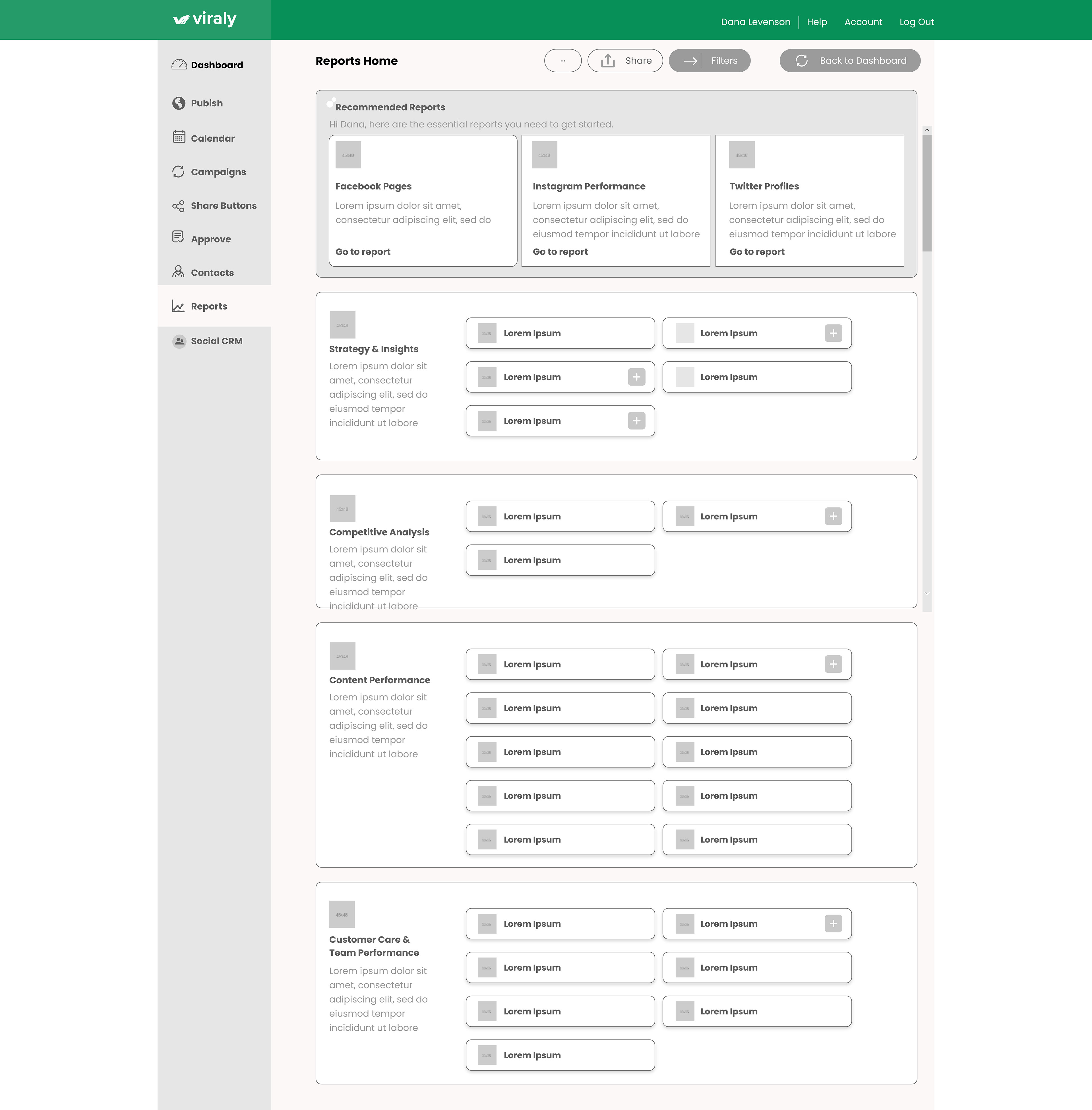
The navigation includes specific navigation to areas that the user needs for creating a campaign, viewing the calendar to be able to schedule posts, etc. and to view reports.
More features are built in that include brand keywords and message tagging etc. all to help the user quickly see what needs to be done to enhance sale posts, event posts, and more.
Campaigns would be customizable to the user. There is even a reviews section added as well as a help section.
The dashboard is the birds eye view of everything the user wants to see at a glance.
The reports page allows the user to see strategy and insights as well as competitive analysis and content performance.
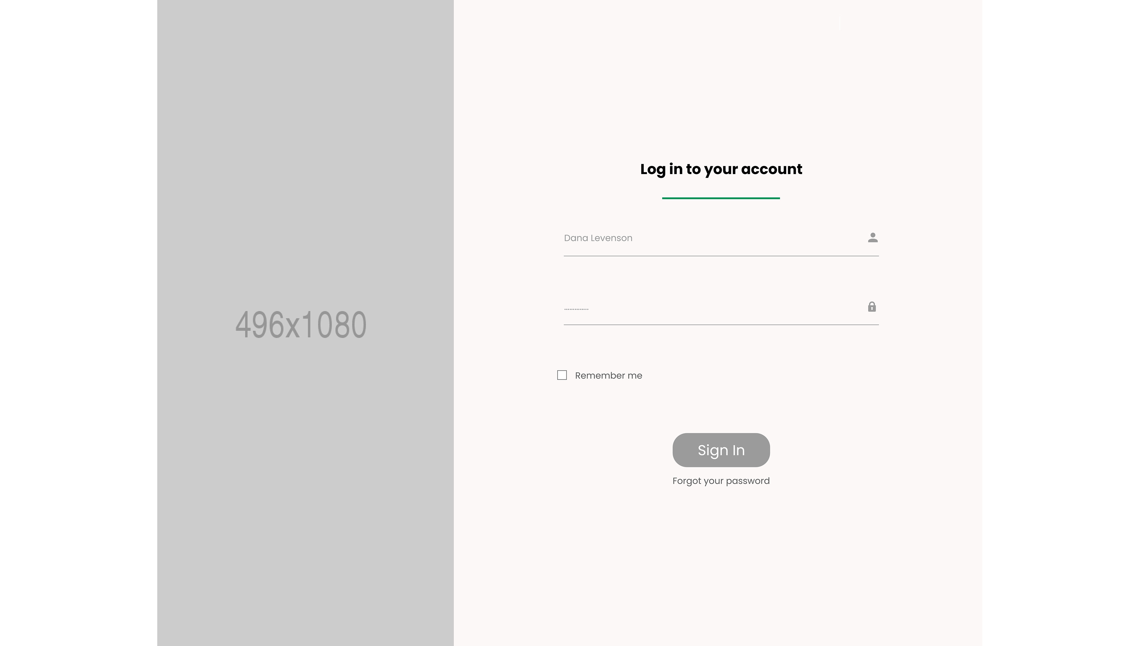
Landing Page Log-in
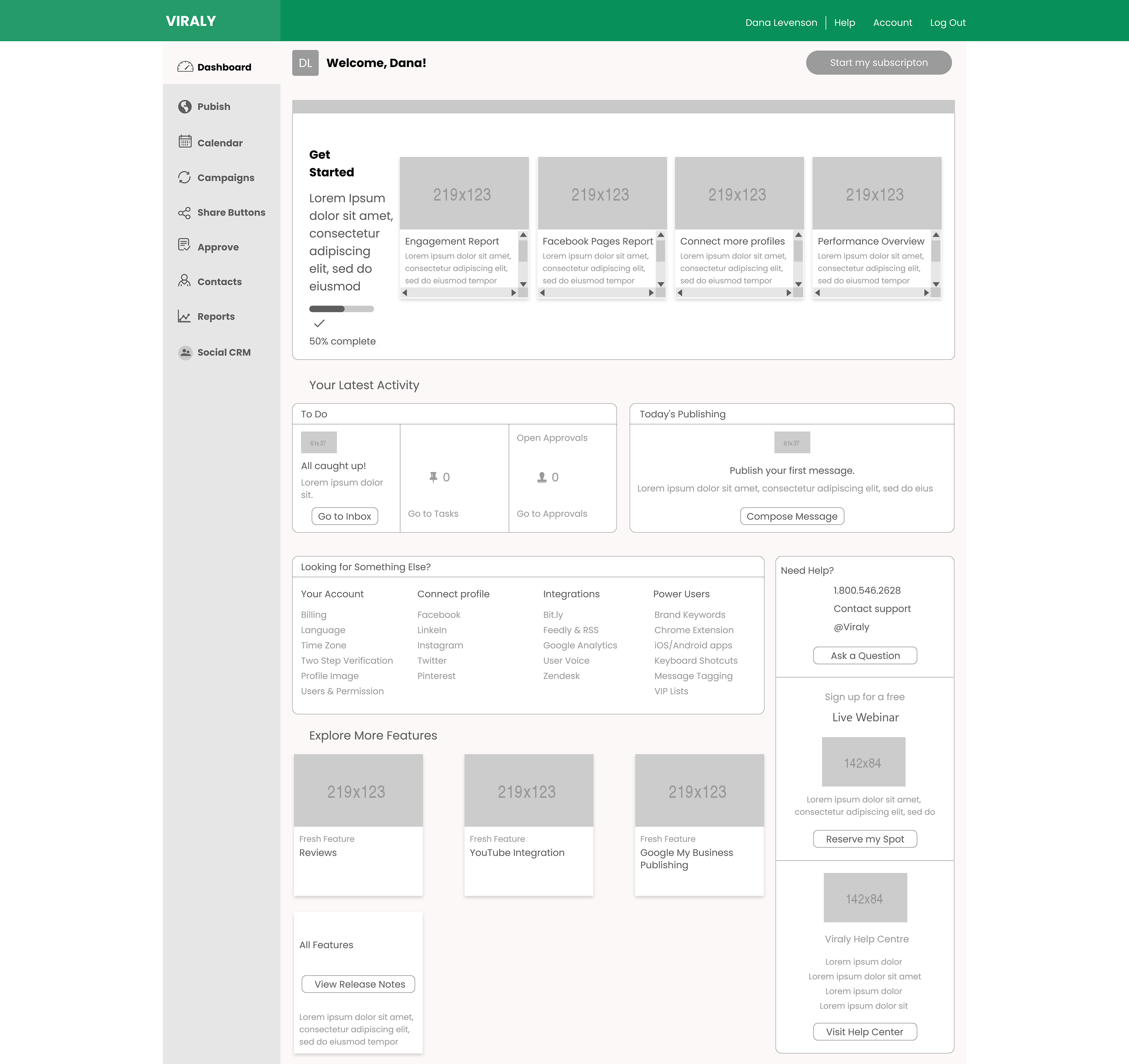
Dashboard
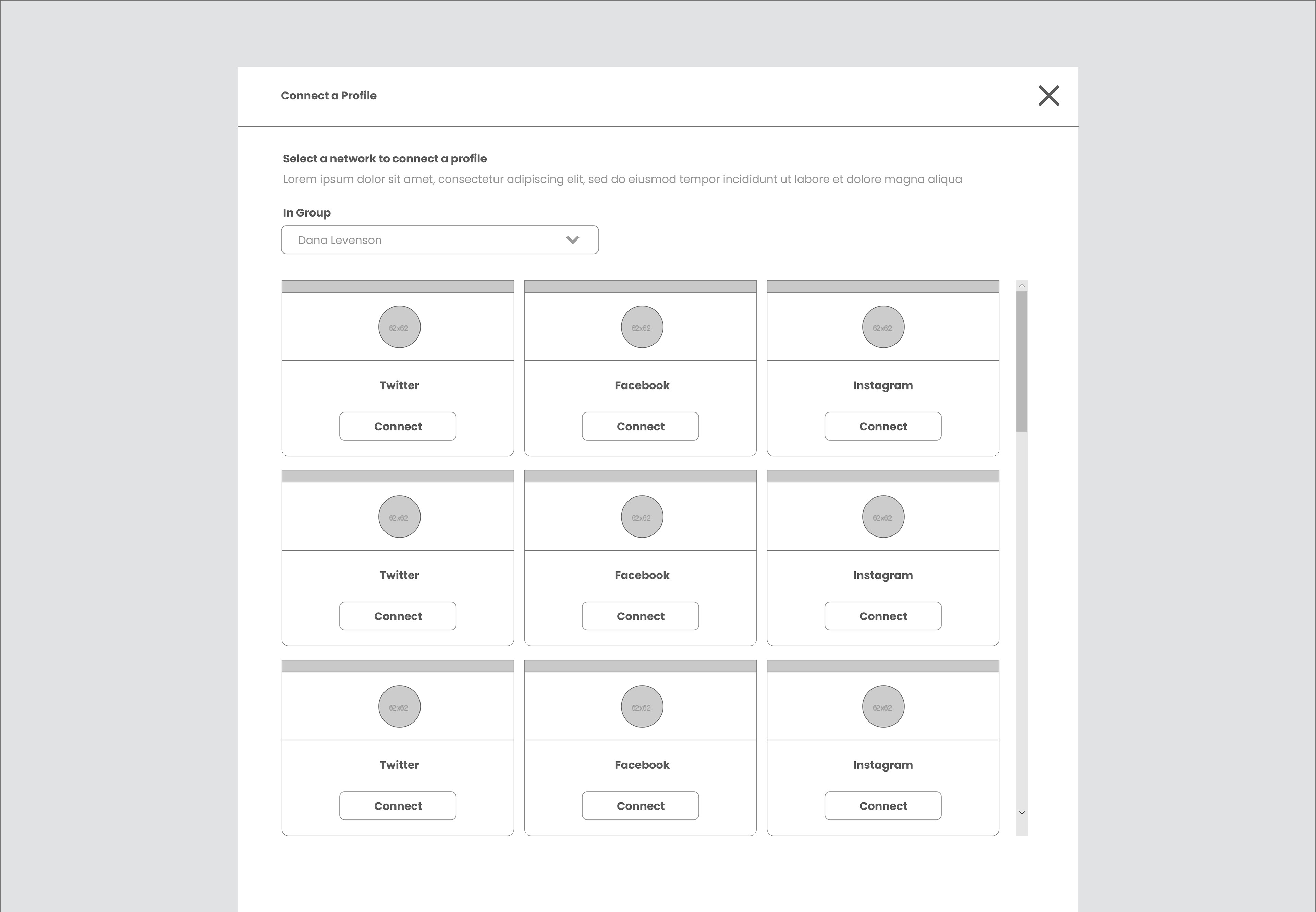
Connect More Profiles Pop Up
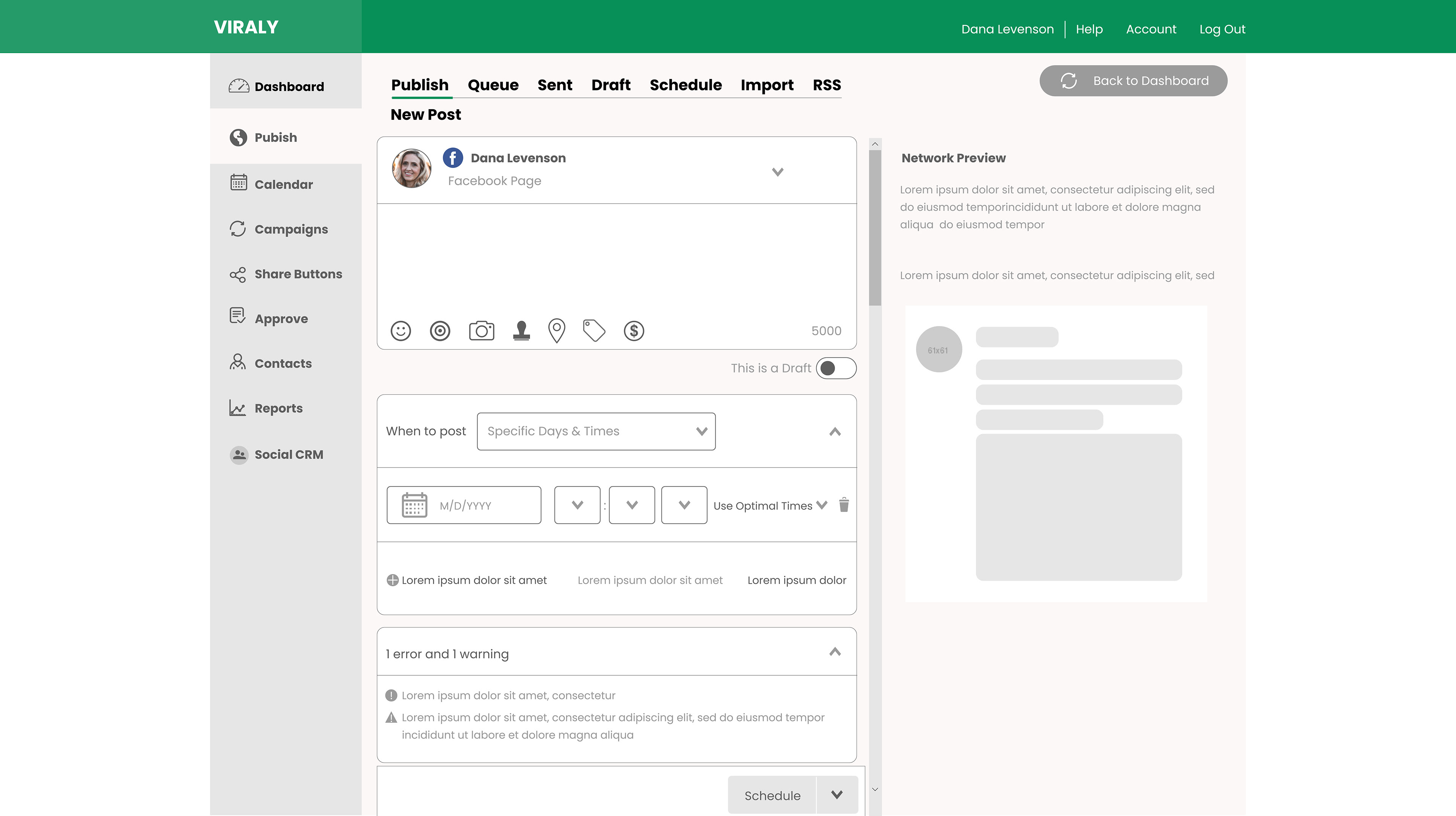
Publish
Campaigns
Calendar
Reports
UI Wireframes
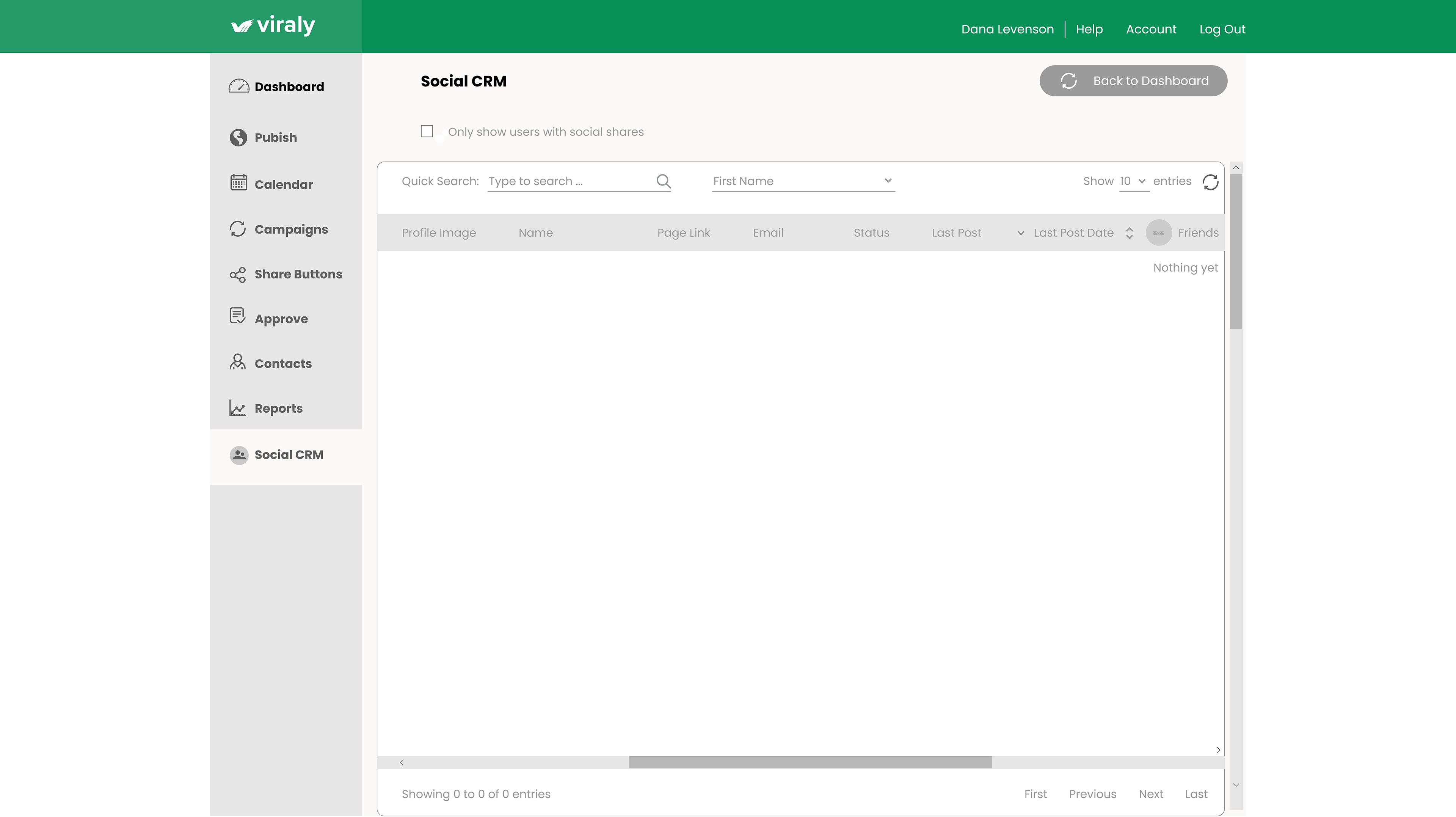
Below are UI wireframes for this project. Here you are able to see the full capabilities of this design.
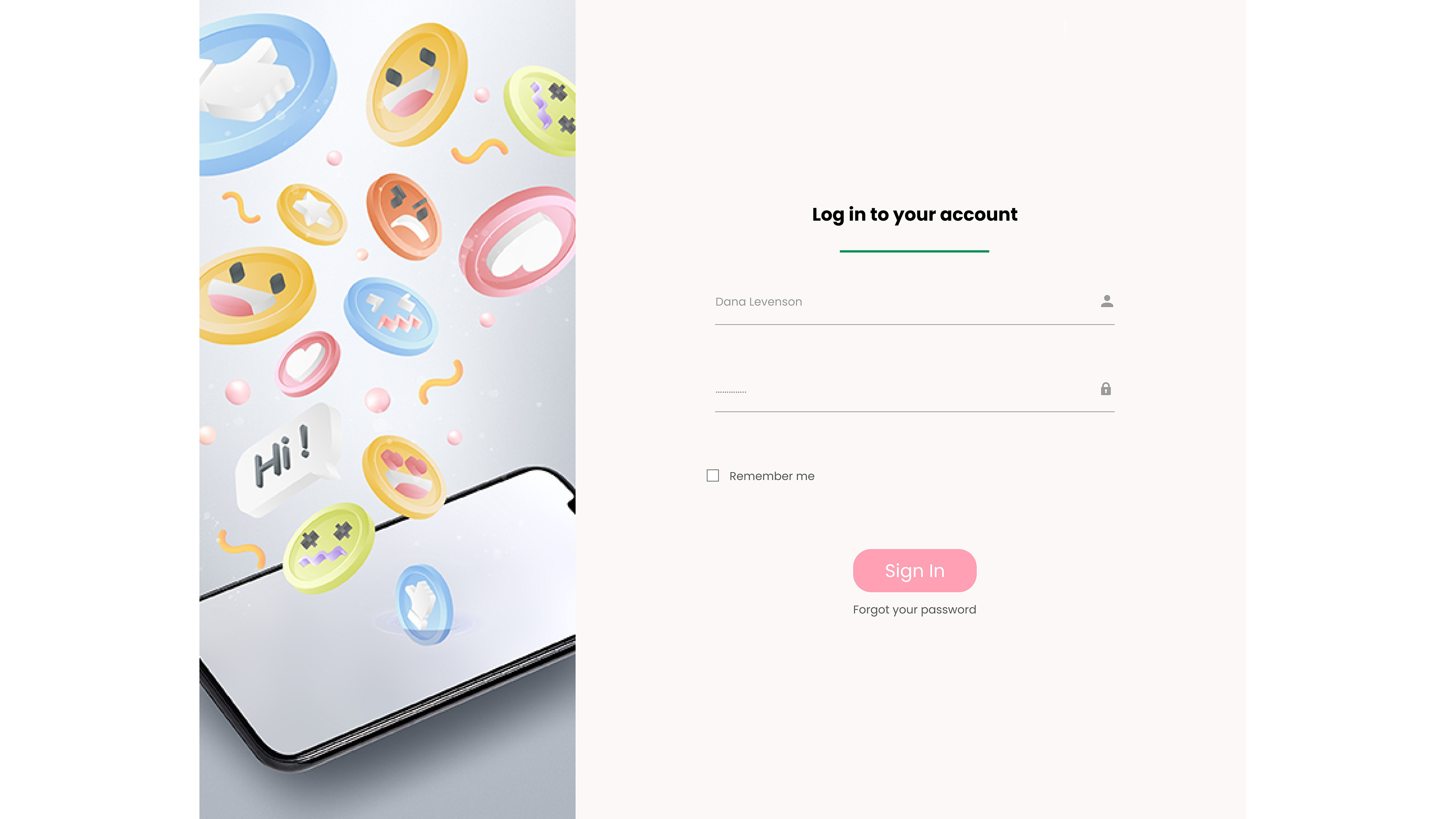
Landing Page Log-In
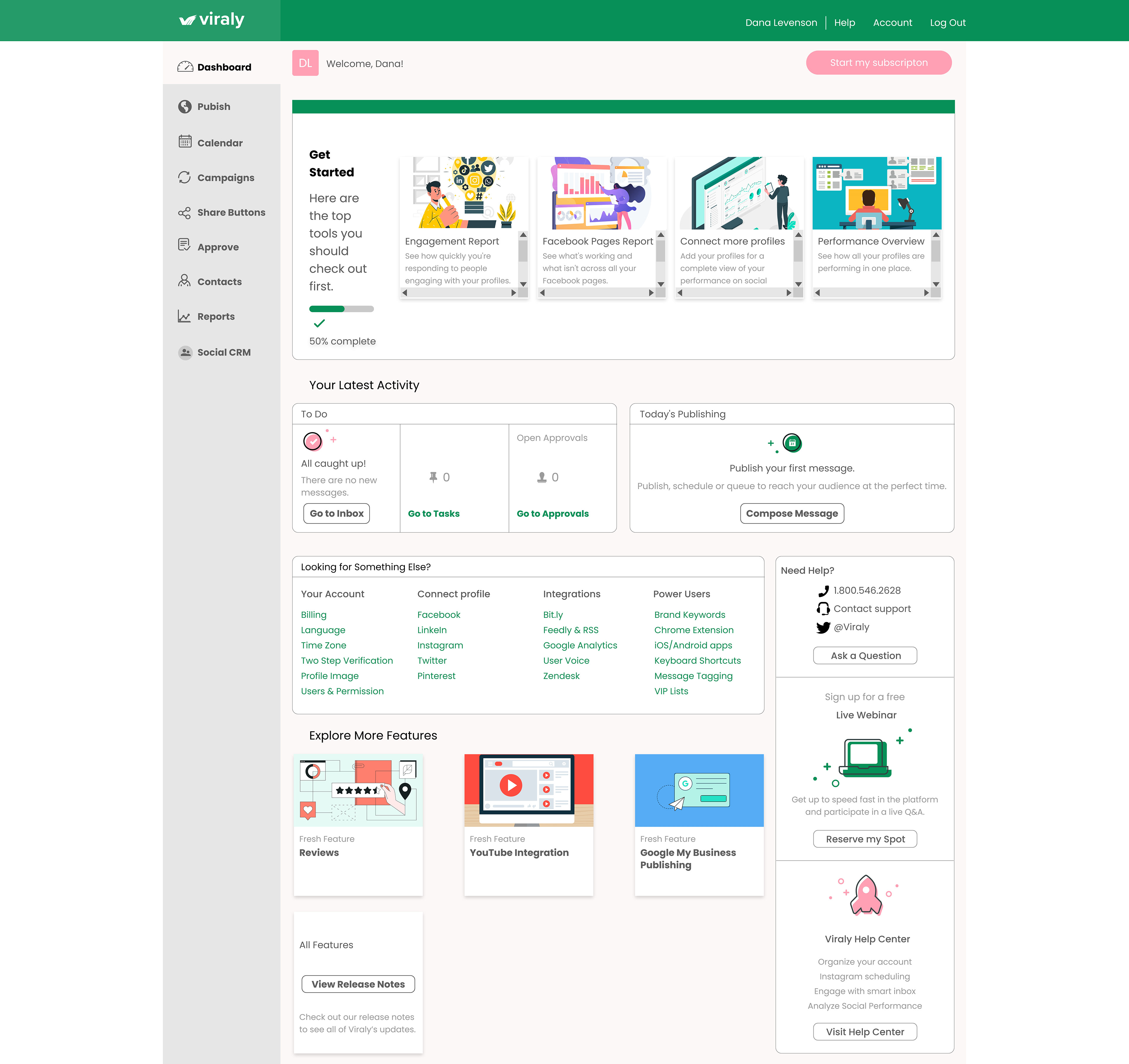
Dashboard
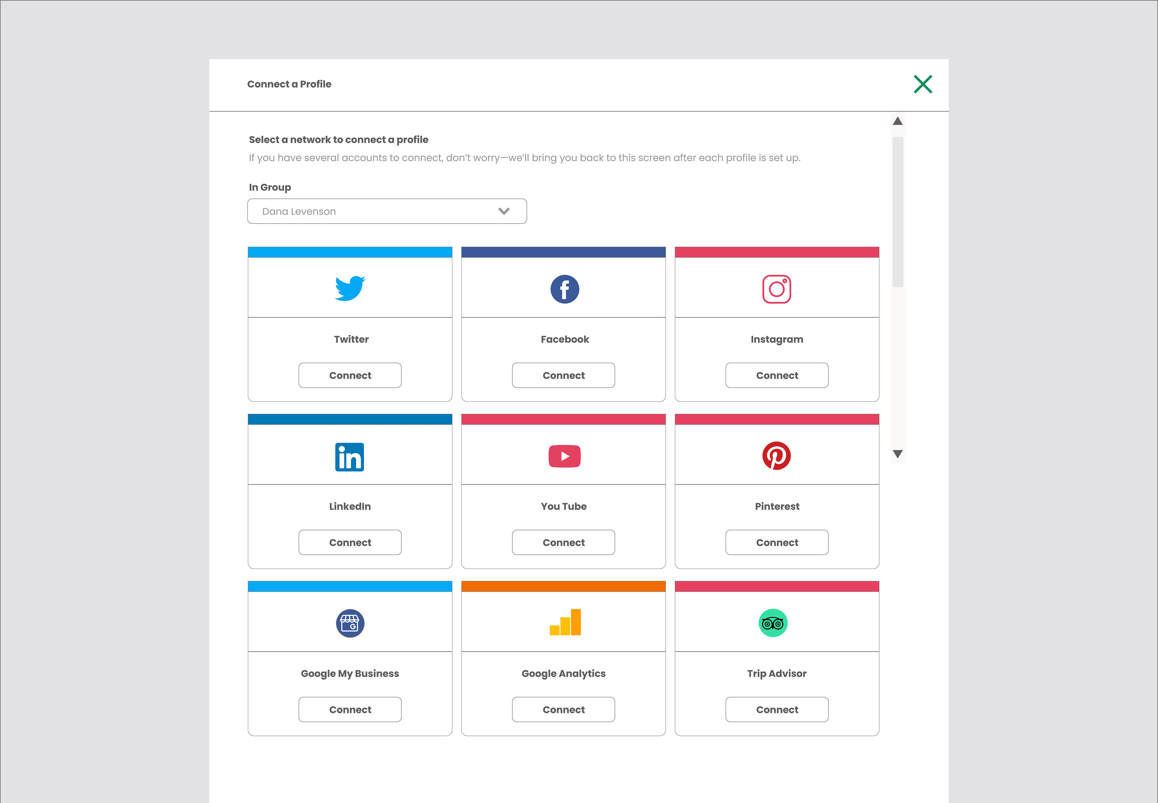
Connect More Profiles Pop Up
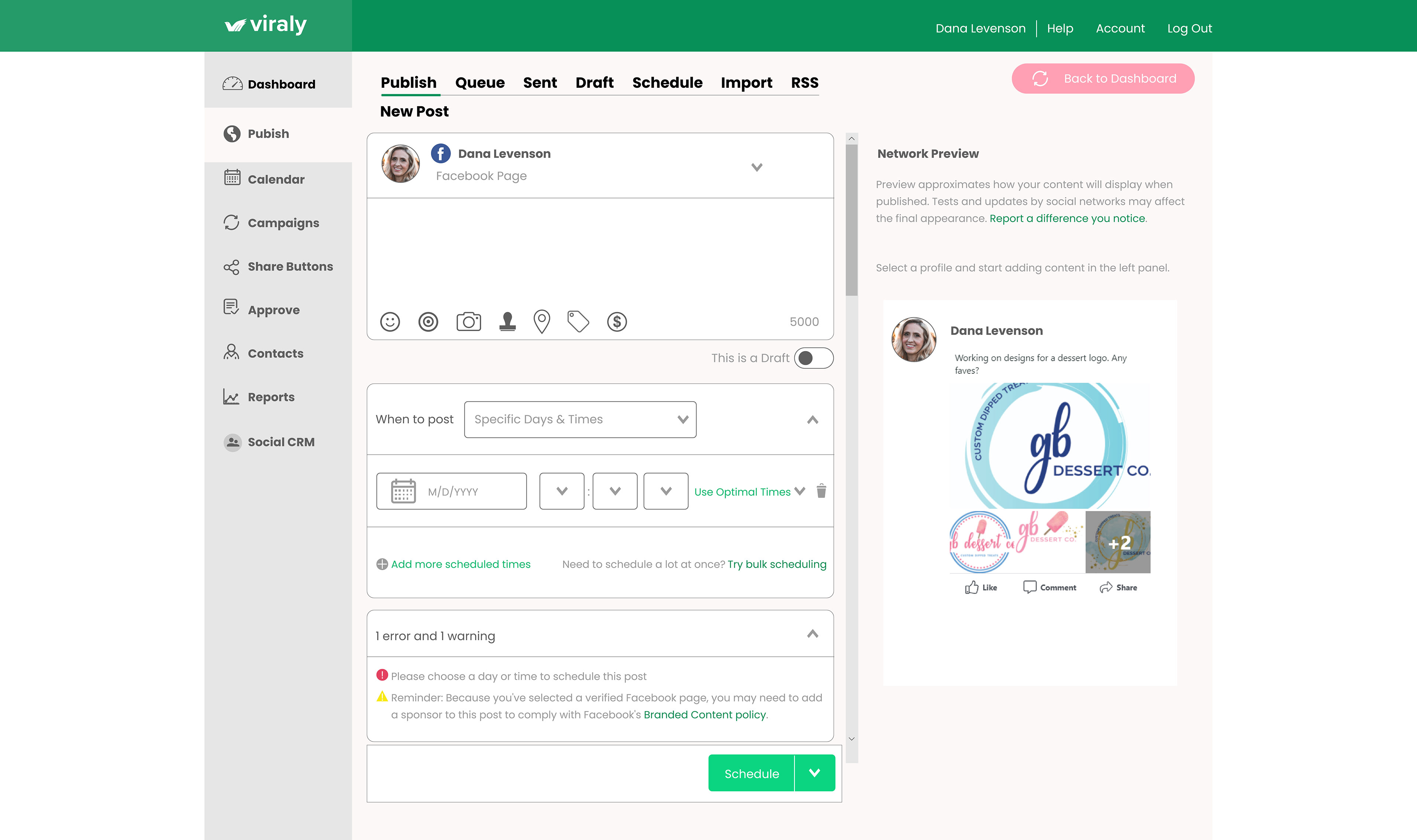
Publish
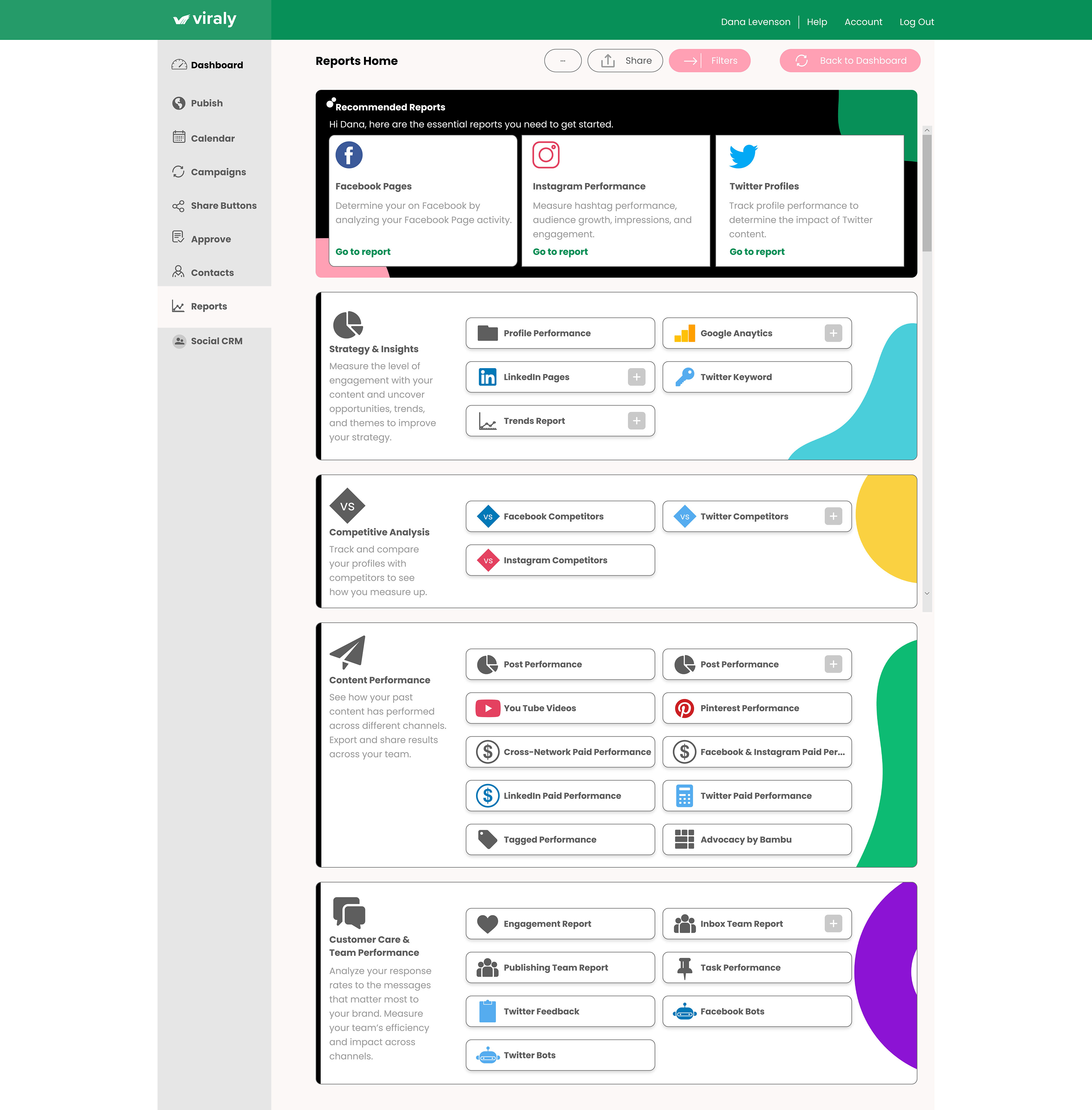
Reports
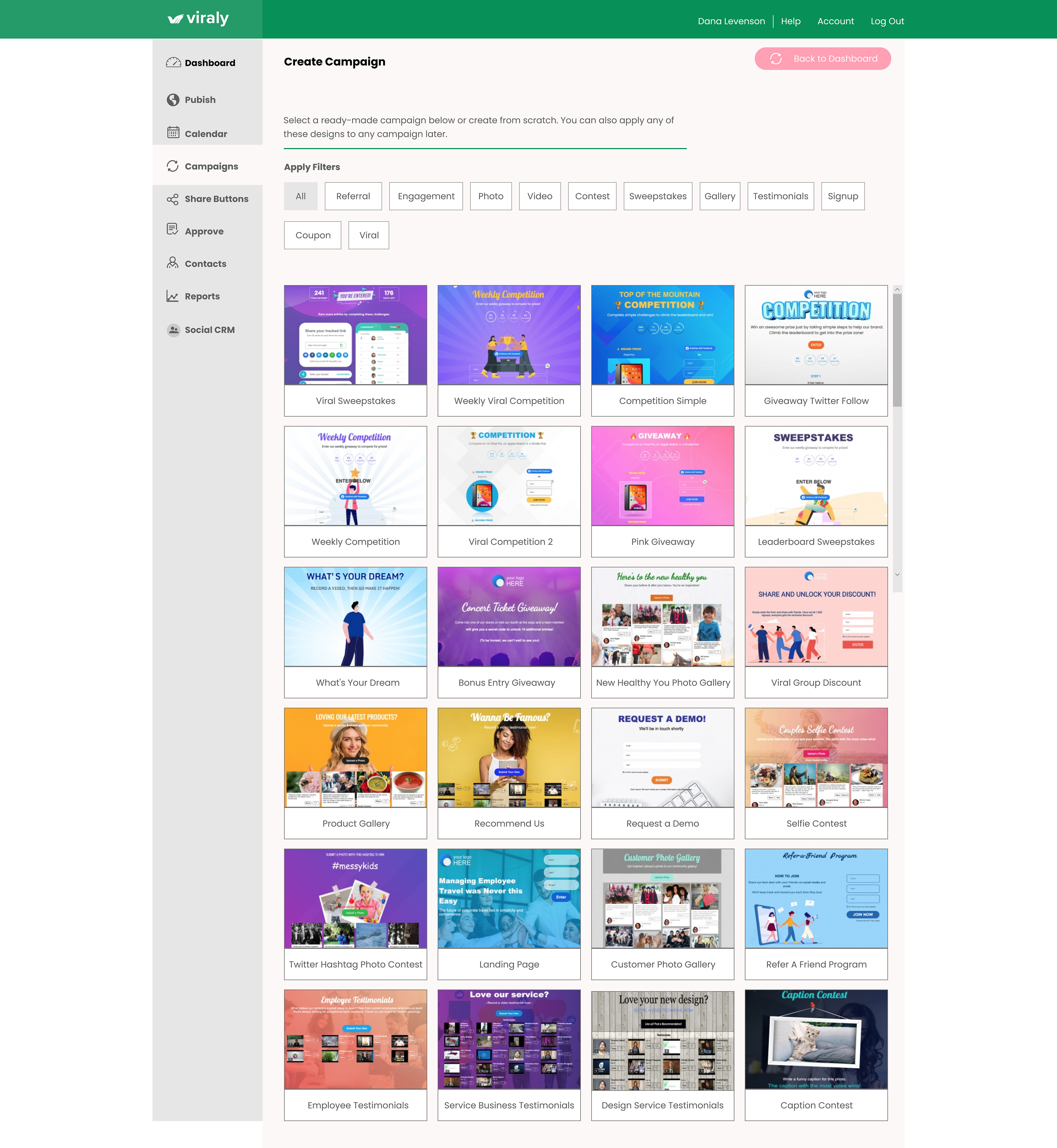
Campaigns
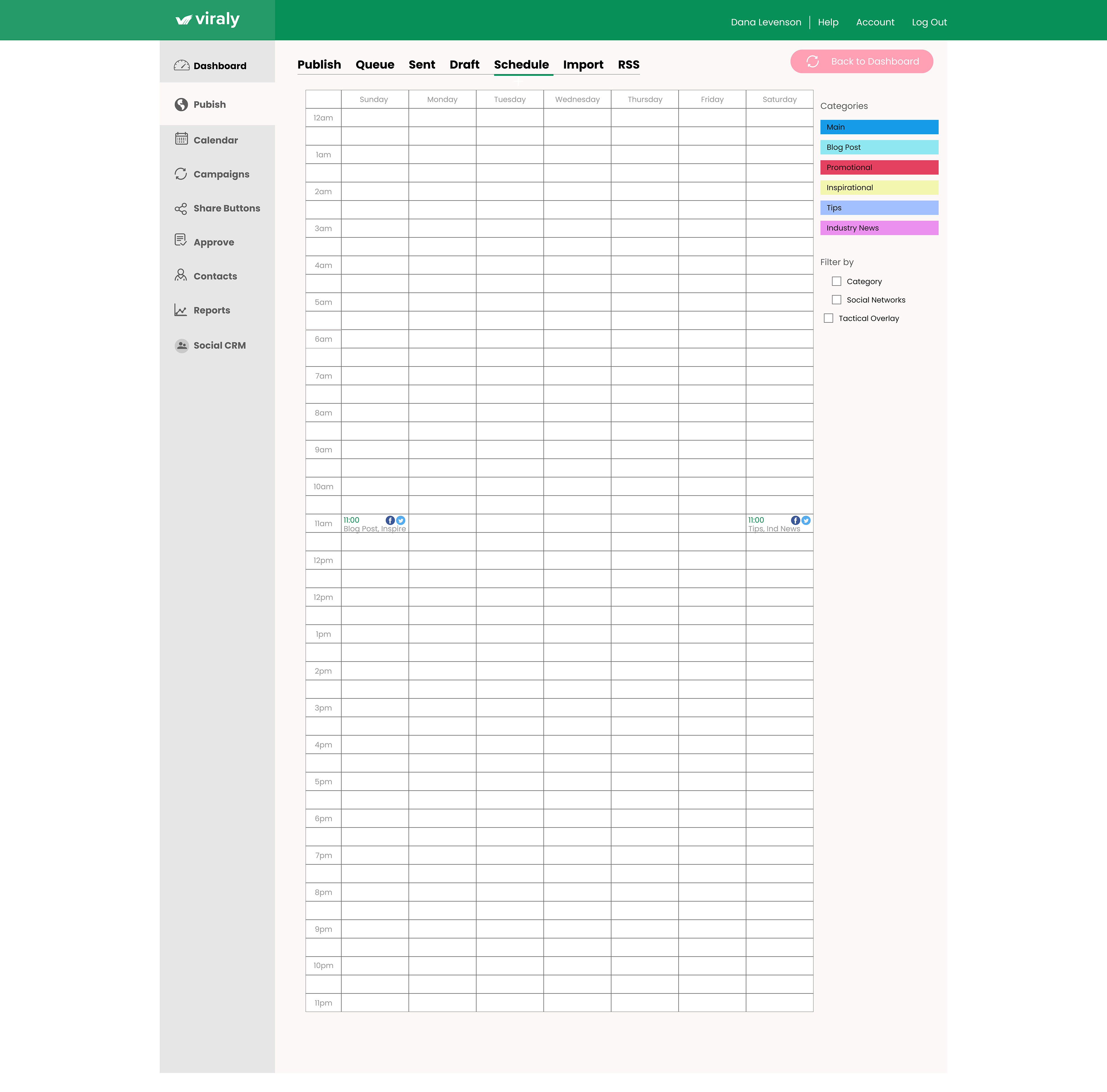
Calendar

Reports: Profile Performance
Interested in this project?
This project is still in working mode but below are links to the prototype. More will be added here at a later date to show the mobile version of this design. Please check back for updates.
Here is the UX Wireframes Link.
https://xd.adobe.com/view/3cc3470b-7b32-4b3e-ba42-b477fb4a8dce-6990/
and here is the UI link.
https://xd.adobe.com/view/21d08ae2-eef7-4c3e-88f0-33836afc5b4b-7483/
https://xd.adobe.com/view/3cc3470b-7b32-4b3e-ba42-b477fb4a8dce-6990/
and here is the UI link.
https://xd.adobe.com/view/21d08ae2-eef7-4c3e-88f0-33836afc5b4b-7483/
Please get in touch if you are a person interested in developing a design for web and mobile or if you are interested in a dashboard design.
